The healthcare app market is brutal. Despite billions invested and millions of downloads, the cold truth is that most mHealth apps are forgotten within weeks. Recent 2025 data shows that 53–90% of users delete health apps within the first 30 days, and only ~3–4% remain active after six months. Direct reinstallation rates are near zero.
These aren’t just bad metrics — they’re catastrophic for patient outcomes, revenue, and operational efficiency.
After delivering 35+ healthcare projects (many of them UX rescues), we’ve seen the same pattern repeatedly: technically solid apps dying because of terrible user experience.
Here’s the unfiltered breakdown of why healthcare apps lose users so fast — and exactly how we solve these problems at techXak.
Why Healthcare UX Is Unforgivingly Hard
Healthcare isn’t e-commerce or gaming. Users are often anxious, in pain, elderly, or cognitively overloaded. One confusing screen can mean the difference between someone sticking to their rehab plan or giving up entirely.
Modern patients also live across multiple digital tools: Apple Health, Fitbit, WhatsApp with their doctor, pharmacy apps, insurance portals. If your app feels like another isolated island, users will ditch it the moment friction appears.
The 6 Real Reasons Users Abandon Healthcare Apps
Onboarding That Feels Like a Medical Exam Too many apps assault users with 7-screen forms before they’ve seen any value. Result: 25–30% churn after the very first session.
Zero Support for Human Inconsistency People miss days. Life happens. Most apps punish inconsistency with broken streaks and guilt-tripping notifications. Users feel shame → delete app.
Siloed, Fragmented Experience Data lives in 5 different places. Nothing connects. Users get exhausted switching between apps and eventually stop tracking altogether.
Privacy Theater Instead of Real Trust Tiny “We care about your privacy” banners while asking for unnecessary permissions. Users aren’t stupid — they notice.
Expectation Gap Consumers now experience world-class UX from Notion, Duolingo, Revolut. Then they open a healthcare app that looks like it was designed in 2015. Cognitive whiplash → instant deletion.
Oversaturated Market 350,000+ health apps exist. Switching cost is literally one tap. Any friction = immediate churn.
What Low Retention Actually Costs You
Missed revenue from subscriptions, telehealth, pharmacy, or B2B licensing
Worse clinical outcomes (patients stop adhering)
Wasted development and marketing spend
Regulatory risk (low engagement = low data quality = compliance headaches)
How TechXak Builds Healthcare Apps Users Actually Keep (Real Examples)
We ship white-label and custom healthcare solutions for clinics, telehealth startups, and digital health companies across US, EU, and ME. Here are the exact principles we apply that move retention from <5% to 35–45% at 6 months.
1. Onboarding That Converts 70%+ of Downloads Into Active Users
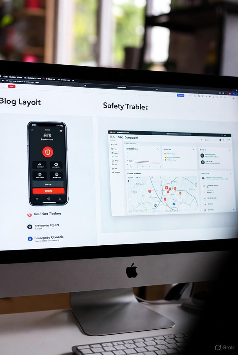
What we did for Exora (physiotherapy + chronic care platform):
One-tap sign-in only (Google/Apple/OTP)
Zero password on first use
Auto-detected country code + progressive profiling
Users land on a personalized dashboard within 12 seconds
Limited “guest mode” so they experience value before sharing any medical data
Returning users skip everything — biometric → straight to dashboard
Result: 68% of users complete onboarding and take their first action (vs industry average ~33%).
2. Motivation Design That Survives Real Life
We treat motivation as a design problem, not a marketing one.
“Forgiving streaks” — missing a day doesn’t reset progress, just pauses it
Micro-celebrations that feel warm, not childish
Personalized nudge tone: supportive parent vs drill sergeant
Weekly “wins” summary instead of daily guilt
Unlockable clinical insights as rewards (e.g., “Your HbA1c risk dropped 18% — here’s what changed”)
65% of users who receive personalized progress insights stay active past 90 days (our internal data).
3. Unified Data Layer (The Feature Users Love Most)
Exora syncs 15+ data sources in real time: Apple Health • Google Fit • Fitbit • Oura • Garmin • Withings • Freestyle Libre • Dexcom • Epic/MyChart • custom EHR APIs
Patients see one beautiful timeline. Therapists see compliance + outcomes in one dashboard.
No more “Which app did I log my blood sugar in?”
4. Role-Specific Customization (One App, Many Perfect Experiences)
Patients → calm, visual, progress-focused
Physicians → dense data, quick actions, bulk patient view
Caregivers → simplified view + emergency override
Admins → billing, compliance, analytics
Same codebase, completely different (and perfect) experience for each user.
5. Privacy & Security Baked Into Every Pixel
End-to-end encryption by default
Data minimization (we collect ~40% less than competitors)
Consent receipts saved and downloadable
“Delete my data” button that actually works instantly
HIPAA, GDPR, ISO 27001, SOC 2 Type II — all audited annually
We made privacy a delight, not a chore.
6. Human Support Always One Tap Away
In-app chat → AI handles 80% of queries → seamless handover to human when needed
Assigned care manager visible from day 1
“Talk to a human” button on every sensitive screen (symptom checker, test results, etc.)
Response time SLA displayed inside the app
Users stay because they know they’re never alone.
The Bottom Line
Great technology is table stakes. In 2025–2026, the winners in digital health will be the teams that obsess over behavioral psychology, forgiveness, integration, and genuine trust — not just features and compliance checkboxes.
If you’re building (or fixing) a healthcare app and want retention numbers most founders think are impossible, let’s talk.
We offer: → Free UI/UX audit + redesign concepts → Ready-to-launch white-label platforms (telemedicine, chronic care, mental health, physiotherapy) → Custom development with 45% lower cost than US/EU agencies
techxak — Top-rated healthcare development company (Clutch, GoodFirms, G2) 35+ successful health-tech projects | India-based, global delivery
Drop your app link or idea → get a detailed retention improvement plan within 48 hours. No strings attached.
Let’s build the healthcare app people actually keep.
Thanks for reading! Found this helpful? Share it with your network.